Every screen in the app
Four screens, and none of them ask you a question you didn't come to answer.
These are real screenshots, not renders. Onboarding is four taps and ends inside Today, already usable.
01 · Today
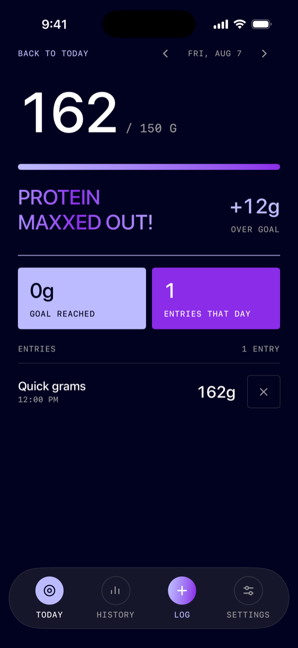
The number is the interface.
Grams so far, goal underneath, and the day's entries as a plain list, each with a cross to delete it. Pass the goal and the screen says so, once, and then leaves you alone.
- Goal set from bodyweight or typed straight in
- The empty day reads as a fresh start, not a failure
- No calorie figure, on this screen or any other
02 · Add protein
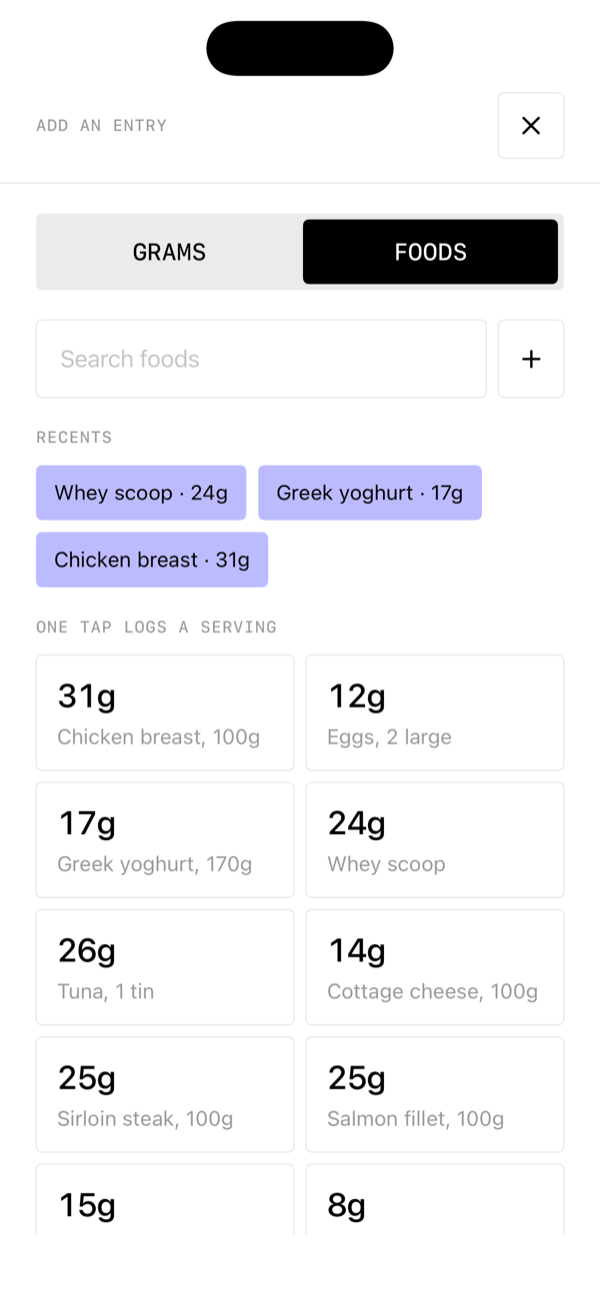
A keypad first, a food database second.
Thirty common foods sit one tap away with a default serving, and search covers the rest. But the fastest path is the one you already know: type the number off the packet and go.
- Name a quick entry and it becomes a shortcut
- Serving multiplier and a direct gram override
- Food detail shows protein only, whatever the database returns
03 · History
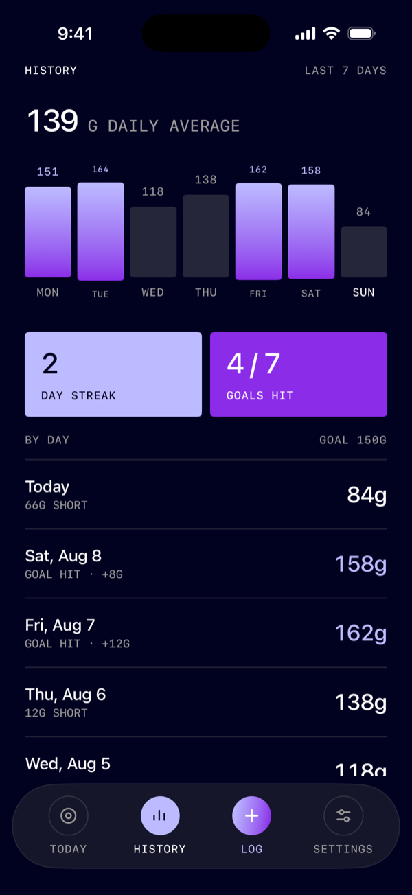
A week of bars and a streak. Deliberately thin.
Seven days, a daily average, and the days you hit. There is no macro breakdown and no weight correlation, because the moment those arrive this stops being a protein app.
- Monthly view behind the same screen
- A broken streak is stated, not punished
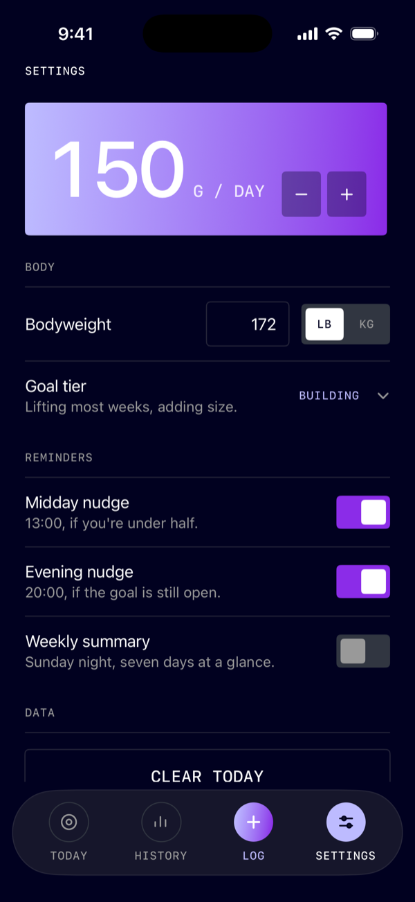
04 · Settings
Your goal, your units, two nudges.
The goal lives at the top, editable at any moment. Bodyweight sits below it as the thing that suggested the number, in pounds or kilograms. Everything else is a toggle you will touch once.
- Export your log, delete it, or reset the app outright
- Nothing to sign into, so nothing to sign out of